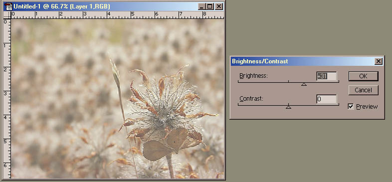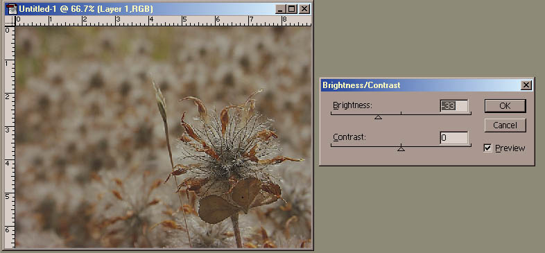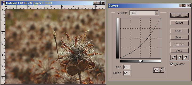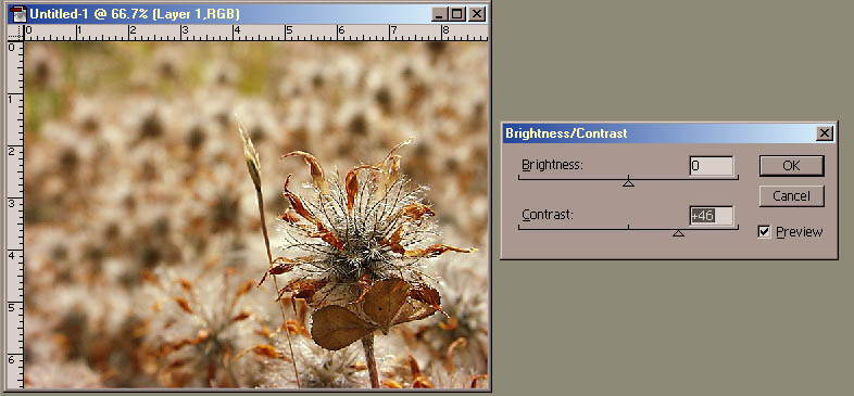
We will now try some adjustments on this image.
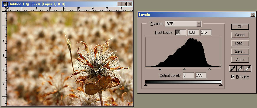
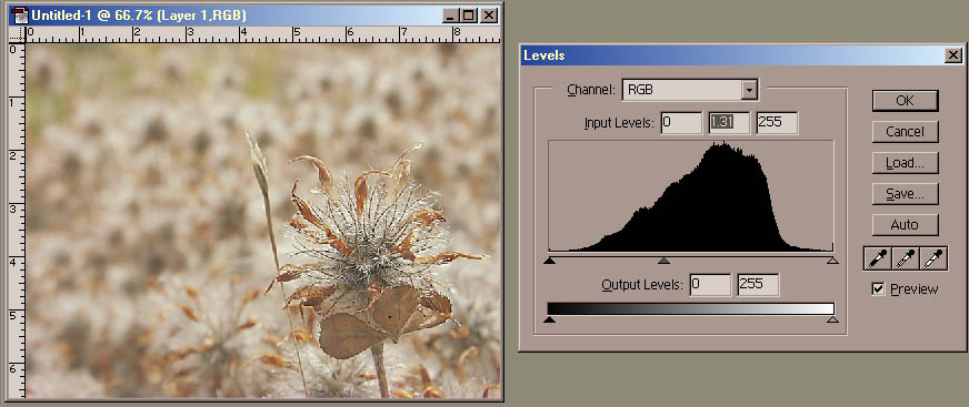
In Levels, you will see a histogram. This is a graph of the *amount* of pixels for each brightness value in the source image. The higher the black line goes, the more pixels that are that particular brightness. The histogram graphs the image *before* it has been changed by the Levels tool -- this is why this part of the Levels tool is called the "Input".
Input sliders -- Whites

Input sliders -- Blacks

Input sliders -- Gamma


In general, you don't need to know what this is doing, but if you're a bit of a geek, this might be interesting to you!
Output devices each have their own dynamic range as well as gamma. Dynamic range means how bright the whitest white and darkest dark can be. For instance, for a printer, the whitest white is the white of the paper, the darkest dark is the color of the black ink when printed on the paper. The gamma is the way the grays are spread out inbetween -- it is rarely uniform, and the way those grays are spread is called the gamma. For instance, if a printer prints 600dpi [dots per inch], but a single black dot shows up as a little larger than 1/600th of an inch, then 50% gray will actually be a little darker than 1/2 black. If you can determine exactly how much the printer is off by, you can adjust the gamma to correct for it, so 50% gray prints correctly at 50% black. Because monitors each have their own gammas, and which can change based on the temp of the room, as well as be different at startup and after the monitor has wartmed up, etc, there was an old Mac utility to allow you to adjust the gamma for your monitor. It displayed a square filled with 50% gray pixels, and next to it another square that was a checkerboard of pure white and pure black pixels. You adjusted the gamma until both looked the same.
More geeky info: the quick answer is gamma is a "power curve" over the normalized pixel values. In more plain speach, this means that if you converted the pixel brightnesses from 0-255 down to 0-1, you would then take each pixel value and raise it to the *power* of the gamma value, then convert that number back to 0-255. eg 128 goes to 0.5 raised to the power 1.31 is 0.403 -- so the input of 0.403 goes to 0.50 and the image gets brighter. You can see this on the histogram: the gamma slider signifies what brightness value will be middle-gray -- if it is moved to the darker areas, those vaules will be pushed more to middle-gray. Similarly, 128 goes to 0.5 raised to the power of 0.59 above is 0.693 and the image gets darker -- the gray slider is moved into the lighter areas, which are pushed darker.
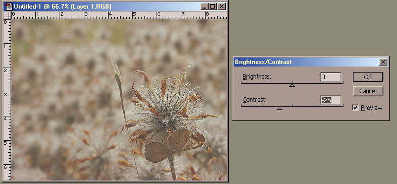
A combination of adjusting all three of these sliders can do drastic wonders for adjusting an image! Levels is far more powerful than Brightness/Contrast.
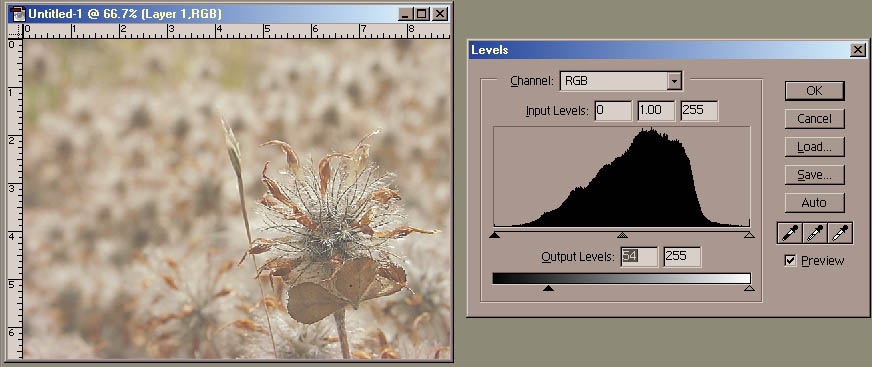
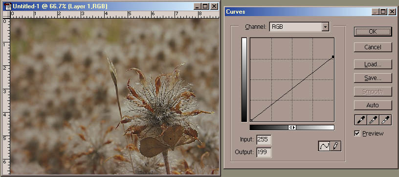
Now let's talk about the slider at the bottom.
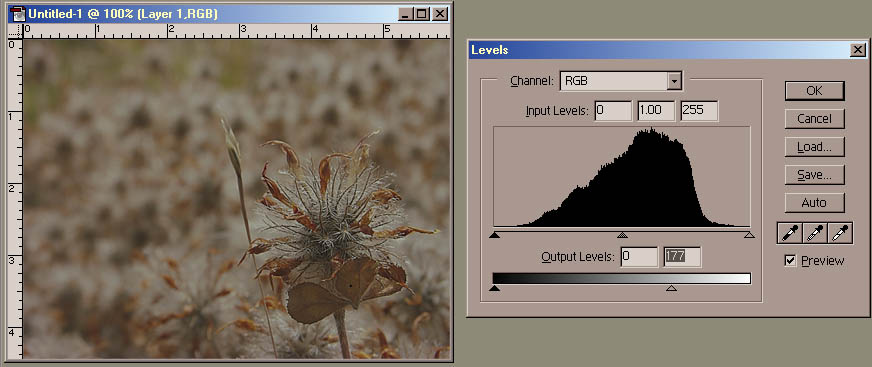
Output sliders -- Whites
The slider at the bottom describes what brightness values are *output* in the image. If you slide the slider on the right, it designates what is the brightest white value -- pure white gets pushed to gray. The rest of the iamge gets darker too.

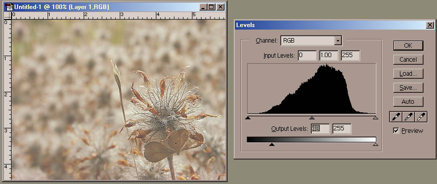
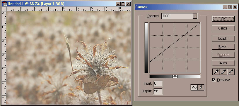
Output sliders -- Darks
Similarly, if you slide the slider on the left, it designates what is the darkest black value -- pure black gets pushed to gray. The rest of the iamge gets brighter too.
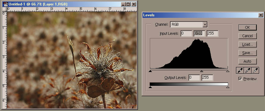
In Levels, you will see a histogram. This is a graph of the *amount* of pixels for each brightness value in the source image. The higher the black line goes, the more pixels that are that particular brightness. The histogram graphs the image *before* it has been changed by the Levels tool -- this is why this part of the Levels tool is called the "Input".
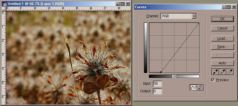
Input sliders -- Whites
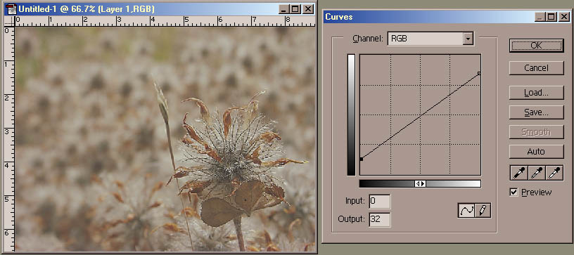
The slider on the right side sets the cap fro the whites in an image. All of the brightness levels to the right of this slider are pushed to white, and the rest are made brighter, but the blackest black remains the same. As you can see below, the image has gotten brighter.
If you push this slider too much, you will "blow out" the image -- causing so much of the highlights to become pure white that the image looks over-exposed.
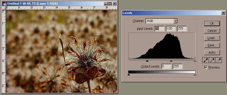
Input sliders -- Blacks
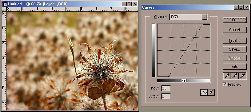
Similarly, the slider on the left side sets the cap for the darks in an image. All of the brightness levels to the left of this slider are pushed to black, and the rest are made darker, but the whitest white remains the same. As you can see below, the image has gotten darker.
If you push this slider too much, you will seriosuly darken the image -- causing so much of the shadow areas to become pure black that the image looks under-exposed.
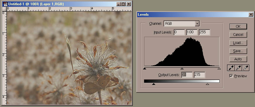
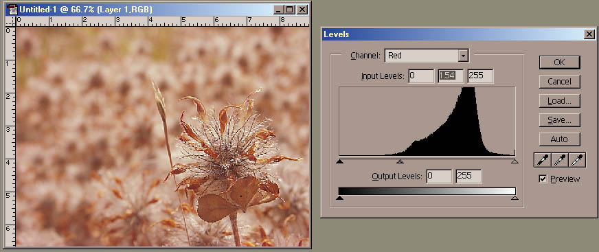
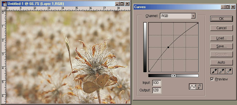
Input sliders -- Gamma
The slider in the middle is one of the most useful. It sets the "gamma" for the image. Basically, it can make the image brighter or darker without changing what is the whitest white or darkest dark in the two images below, you can see one gets brighter, and one gets darker.
The middle slider indicates which value will become 50% gray -- so as the slider moves into the lighter areas, the image gets darkers, because what was once bright gets moved darker towards gray. Similarly, as the slider is moved into the darker areas, the image gets brighter, because those darker values are getting pushed brighter. But for both, the lightest lights and darkest darks remain the same.
In general, you don't need to know what this is doing, but if you're a bit of a geek, this might be interesting to you!
Output devices each have their own dynamic range as well as gamma. Dynamic range means how bright the whitest white and darkest dark can be. For instance, for a printer, the whitest white is the white of the paper, the darkest dark is the color of the black ink when printed on the paper. The gamma is the way the grays are spread out inbetween -- it is rarely uniform, and the way those grays are spread is called the gamma. For instance, if a printer prints 600dpi [dots per inch], but a single black dot shows up as a little larger than 1/600th of an inch, then 50% gray will actually be a little darker than 1/2 black. If you can determine exactly how much the printer is off by, you can adjust the gamma to correct for it, so 50% gray prints correctly at 50% black. Because monitors each have their own gammas, and which can change based on the temp of the room, as well as be different at startup and after the monitor has wartmed up, etc, there was an old Mac utility to allow you to adjust the gamma for your monitor. It displayed a square filled with 50% gray pixels, and next to it another square that was a checkerboard of pure white and pure black pixels. You adjusted the gamma until both looked the same.
More geeky info: the quick answer is gamma is a "power curve" over the normalized pixel values. In more plain speach, this means that if you converted the pixel brightnesses from 0-255 down to 0-1, you would then take each pixel value and raise it to the *power* of the gamma value, then convert that number back to 0-255. eg 128 goes to 0.5 raised to the power 1.31 is 0.403 -- so the input of 0.403 goes to 0.50 and the image gets brighter. You can see this on the histogram: the gamma slider signifies what brightness value will be middle-gray -- if it is moved to the darker areas, those vaules will be pushed more to middle-gray. Similarly, 128 goes to 0.5 raised to the power of 0.59 above is 0.693 and the image gets darker -- the gray slider is moved into the lighter areas, which are pushed darker.
A combination of adjusting all three of these sliders can do drastic wonders for adjusting an image! Levels is far more powerful than Brightness/Contrast.
Now let's talk about the slider at the bottom.
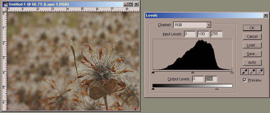
Output sliders -- Whites
The slider at the bottom describes what brightness values are *output* in the image. If you slide the slider on the right, it designates what is the brightest white value -- pure white gets pushed to gray. The rest of the iamge gets darker too.
Output sliders -- Darks
Similarly, if you slide the slider on the left, it designates what is the darkest black value -- pure black gets pushed to gray. The rest of the iamge gets brighter too.